In a previous post, we talked about looking at Apple Inc's (AAPL) price performace after an iPhone announcement. A few months later, let's look at what happened and see if the pattern repeated.
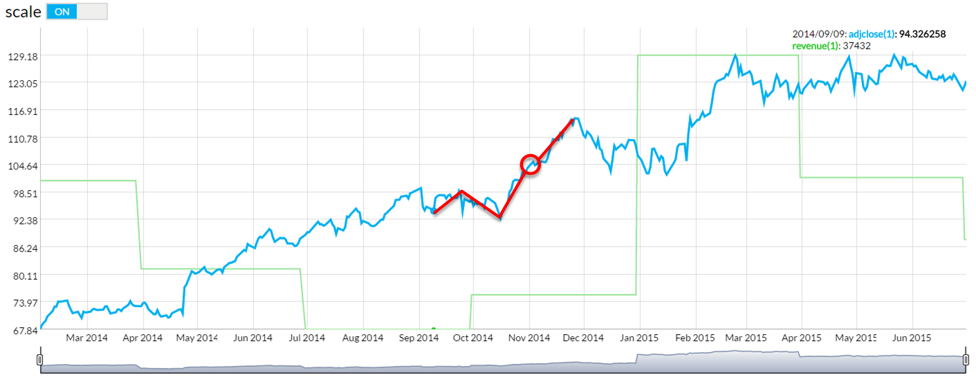
To reveiw, the previous three iPhone launches had seen a loose trend following their September announcements: by the time November rolled around, the price was higher than at the time of the announcement. This was typically seen in a manner similar to the graph below, which shows Apple's price responding to the iPhone 6 announcement. For this graph, I'm using the Genovest Visualizer tool.
 Let's compare that to what Apple's stock currently looks like following the announcement of the iPhone 7.
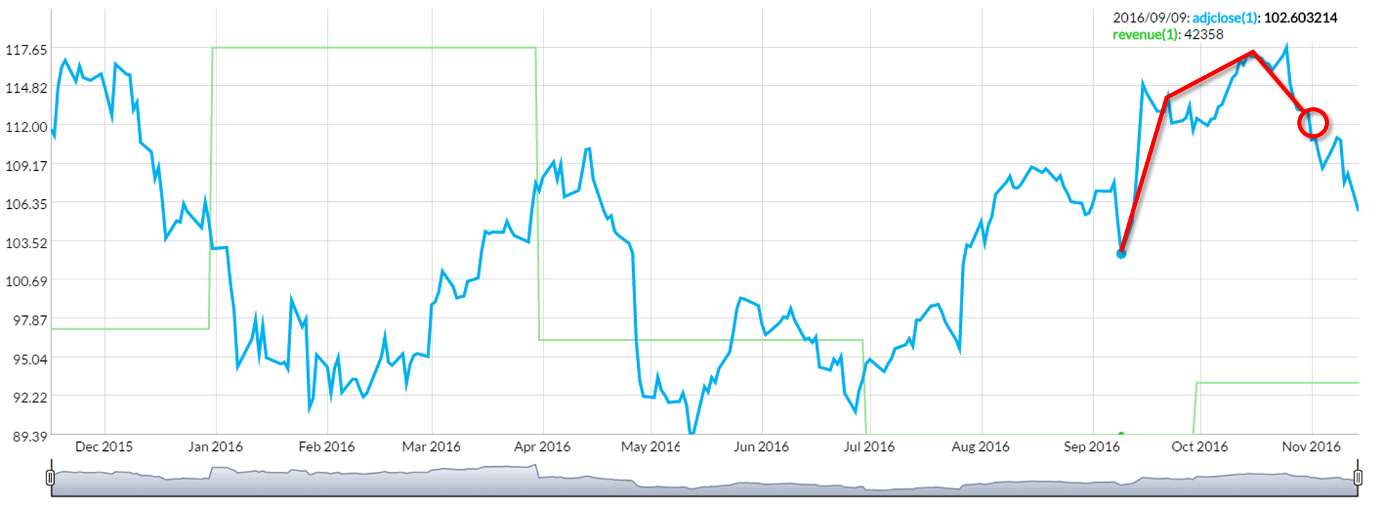 In both pictures, the red circle locates Apple's price at the beginning of November. In this case, our previous idea is technically true: Apple's stock was higher at the beginning of November than at the time of the announcement.
However, being "technically true" doesn't tell the whole story, and following November, the stock has fallen to levels dangerously close to that of the recent September 9th announcement. The reasons for this could be numerous: lower than anticipated demand in a more saturated market, concerns over US import abilities following the election, not meeting projections... We'll see if it continues to drop or if it has found a price floor.
Whatever the case, this is a pattern that seems to be at least partially true and could possibly lead to a profitable strategy.